The creation of ‘smart buildings’ through the application of a cloud based operating system is at the forefront of effective property management. It creates environmental benefits by reducing carbon emissions and helps to increase real estate value. Workman LLP asked Epigram to help launch a new system aimed at UK and international real estate investors, developers, asset managers and property funds.
Visual identity development
Concept development and direction
Creative guidance and support
Logotype and branding
Interactive pdf brochure
PowerPoint templates
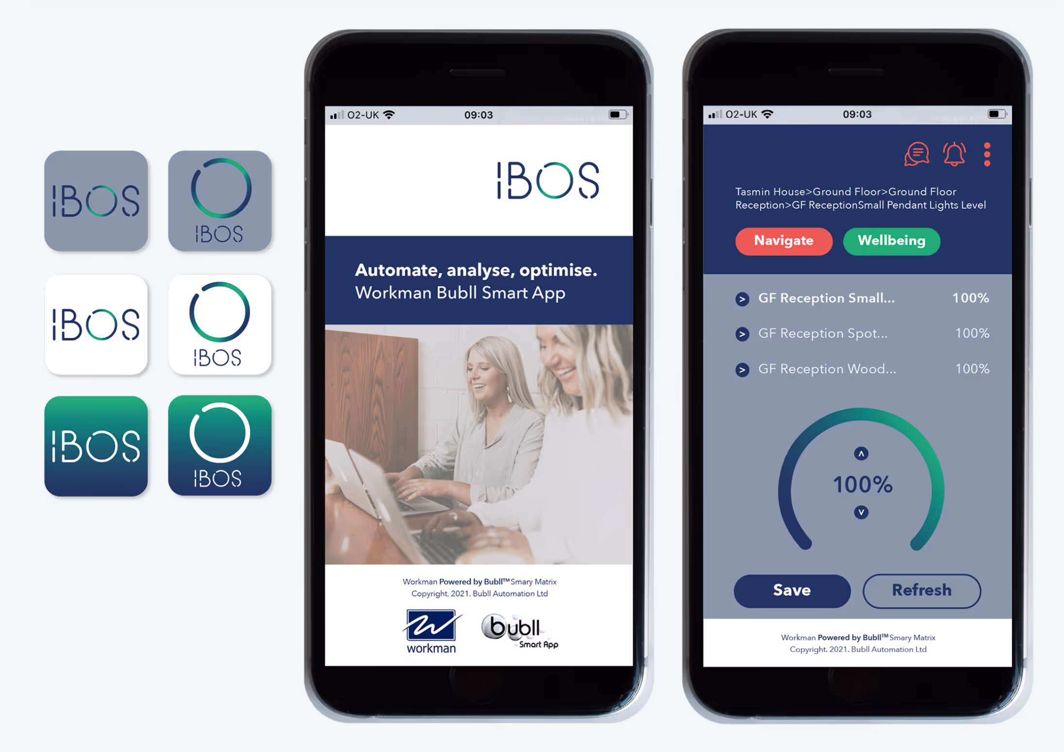
Mobile phone app interface design

The Challenge
To create a distinctive visual identity, which helps to set the operating system apart from its competitors. An identity that can be consistently applied to a range of collateral required to promote and sell the product.
Internal teams lacked a unified, high-quality image resource. The result? Diluted messaging, and a brand experience that didn’t live up to the firm’s reputation for attention to detail and local presence.

The Solution
We explored several visual approaches including a subtle reflection of the parent brand and a completely new ‘wild card’ approach. We are pleased to say the latter was chosen and helped launch the product in a bold new direction.
Working collaboratively, we established an image strategy focused on:
- Hero Imagery: Abstract, macro photography showcasing texture and detail – echoing the brand idea that “a little detail goes a long way”. These images created standout moments in key marketing and communications materials.
- Supporting Imagery: Curated London-themed photography capturing local architecture, cityscapes, and bespoke details from within Russell-Cooke’s own offices – from Georgian staircases to rooftop beehives. The imagery reinforced the firm’s personality and sense of place.
- System and Structure: We categorised images into Hero and Supporting tiers, providing clear usage guidance for internal teams. This ensured flexibility across formats, from brochures to digital content, while maintaining brand cohesion.

The Result
A contemporary logotype designed to convey digital technology in a clear and simple way. Supported by a stylish colour palette and appealing photography, the new brand was implemented and ensured a successful launch to internal and external audiences.
The result is a flexible, authentic visual identity that mirrors the firm’s ethos: expert, approachable, and firmly embedded in the city it serves.